JavaServer Faces 2.0
By Cay Horstmann
35,864 Downloads · Refcard 58 of 185 (see them all)
Download
FREE PDF
The Essential JavaServer Faces 2.0 Cheat Sheet
JavaServer Faces 2.0
JSF Overview
JavaServer Faces (JSF) is the “official” component-based view technology in the Java EE web tier. JSF includes a set of predefined UI components, an event-driven programming model, and the ability to add third-party components. JSF is designed to be extensible, easy to use, and toolable. This refcard describes JSF 2.0.
Development Process
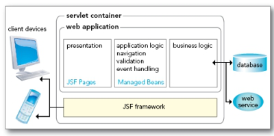
A developer specifies JSF components in JSF pages, combining JSF component tags with HTML and CSS for styling. Components are linked with managed beans—Java classes that contain presentation logic and connect to business logic and persistence backends.

In JSF 2.0, it is recommended that you use the facelets format for your pages:
<?xml version=”1.0” encoding=”UTF-8”?>
<!DOCTYPE html PUBLIC “-//W3C//DTD XHTML 1.0 Strict//EN”
“http://www.w3.org/TR/xhtml1/DTD/xhtml1-strict.dtd”>
<html xmlns=”http://www.w3.org/1999/xhtml”
xmlns:f=”http://java.sun.com/jsf/core”
xmlns:h=”http://java.sun.com/jsf/html”
xmlns:ui=”http://java.sun.com/jsf/facelets”>
<h:head>...</h:head>
<h:body>
<h:form>
...
</h:form>
</h:body>
</html>
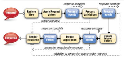
These common tasks give you a crash course into using JSF.
Text Field
![]()
page.xhtml
<h:inputText value=”#{bean1.luckyNumber}”>
WEB-INF/classes/com/corejsf/SampleBean.java
@ManagedBean(name=”bean1”)
@SessionScoped
public class SampleBean {
public int getLuckyNumber() { ... }
public void setLuckyNumber(int value) { ... }
...
}
Button
![]()
page.xhtml
<h:commandButton value=”press me” action=”#{bean1.login}”/>
WEB-INF/classes/com/corejsf/SampleBean.java
@ManagedBean(name=”bean1”)
@SessionScoped
public class SampleBean {
public String login() {
if (...) return “success”; else return “error”;
}
...
}
The outcomes success and error can be mapped to pages in faces-config.xml. if no mapping is specified, the page /success.xhtml or /error.xhtml is displayed.
Radio Buttons
![]()
page.xhtml
<h:selectOneRadio value=”#{form.condiment}>
<f:selectItems value=”#{form.items}”/>
</h:selectOneRadio>
WEB-INF/classes/com/corejsf/SampleBean.java
public class SampleBean {
private static Map<String, Object> items;
static {
items = new LinkedHashMap<String, Object>();
items.put(“Cheese”, 1); // label, value
items.put(“Pickle”, 2);
...
}
public Map<String, Object> getItems() { return items; }
public int getCondiment() { ... }
public void setCondiment(int value) { ... }
...
}

Validation and Conversion
Page-level validation and conversion:
<h:inputText value=”#{bean1.amount}” required=”true”>
<f:validateDoubleRange maximum=”1000”/>
</h:inputText>
<h:outputText value=”#{bean1.amount}”>
<f:convertNumber type=”currency”/>
</h:outputText>
The number is displayed with currency symbol and group separator: $1,000.00
Using the Bean Validation Framework (JSR 303) 2.0
public class SampleBean {
@Max(1000) private BigDecimal amount;
}
Error Messages
![]()
<h:outputText value=”Amount”/>
<h:inputText id=”amount” label=”Amount” value=”#{payment.amount}”/>
<h:message for=”amount”/>
Resources and Styles
page.xhtml
<h:outputStylesheet library=”css” name=”styles.css” target=”head”/>
...
<h:outputText value=”#{msgs.goodbye}!” styleClass=”greeting”>
faces-config.xml
<application>
<resource-bundle>
<base-name>com.corejsf.messages</base-name>
<var>msgs</var>
</resource-bundle>
</application>
WEB-INF/classes/com/corejsf/messages.properties
goodbye=Goodbye
WEB-INF/classes/com/corejsf/messages_de.properties
goodbye=Auf Wiedersehen
resources/css/styles.css
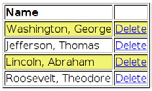
.greeting {
font-style: italic;
font-size: 1.5em;
color: #eee;
}
Table with links

<h:dataTable value=”#{bean1.entries}” var=”row” styleClass=”table”
rowClasses=”even,odd”>
lt;h:column>
<f:facet name=”header”>
<h:outputText value=”Name”/>
</f:facet>
<h:outputText value=”#{row.name}”/>
</h:column>
<h:column>
<h:commandLink value=”Delete” action=”#{bean1.deleteAction}”
immediate=”true”>
<f:setPropertyActionListener target=”#{bean1.idToDelete}”
value=”#{row.id}”/>
</h:commandLink>
</h:column>
</h:dataTable>
WEB-INF/classes/com/corejsf/SampleBean.java
public class SampleBean {
private int idToDelete;
public void setIdToDelete(int value) { idToDelete = value; }
public String deleteAction() {
// delete the entry whose id is idToDelete
return null;
}
public List<Entry> getEntries() { ... }
...
}
Ajax 2.0
<h:commandButton value=”Update”>
<f:ajax execute=”
</h:commandButton>
lifecycle

The jsf expression language
An EL expression is a sequence of literal strings and expressions of the form base[expr1][expr2]... As in JavaScript, you can write base.identifier instead of base[‘identifier’] or base[“identifier”]. The base is one of the names in the table below or a bean name.
| header | A Map of HTTP header parameters, containing only the first value for each name |
| headerValues | A Map of HTTP header parameters, yielding a String[] array of all values for a given name |
| param | A Map of HTTP request parameters, containing only the first value for each name |
| paramValues | A Map of HTTP request parameters, yielding a String[] array of all values for a given name |
| cookie | A Map of the cookie names and values of the current request |
| initParam | A Map of the initialization parameters of this web application |
|
requestScope, sessionScope, applicationScope, viewScope 2.0 |
A map of all attributes in the given scope |
| facesContext | The FacesContext instance of this request |
| view | The UIViewRoot instance of this request |
| component 2.0 | The current component |
| cc 2.0 | |
| resource 2.0 | Use resource[‘library:name’] to access a resource |
Value expression: a reference to a bean property or an entry in a map, list or array. Examples:
userBean.name calls getName or setName on the userBean object pizza.choices[var] calls pizza.getChoices().get(var) or pizza.getChoices().put(var, ...)
Method expression: a reference to a method and the object on
which it is to be invoked. Example:
userBean.login calls the login method on the userBean object
when it is invoked. 2.0: Method expressions can contain parameters: userBean.login(‘order page’)
In JSF, EL expressions are enclosed in #{...} to indicate deferred evaluation. The expression is stored as a string and evaluated when needed. In contrast, JSP uses immediate evaluation, indicated by ${...} delimiters.
2.0: EL expressions can contain JSTL functions
|
fn:contains(str, substr), fn:containsIgnoreCase(str, substr) fn:startsWith(str, substr) fn:endsWith(str, substr) fn:length(str) fn:indexOf(str) fn:join(strArray, separator) fn:split(str, separator) fn:substring(str, start, pastEnd) |
fn:substringAfter(str, separator) fn:substringBefore(str, separator) fn:replace(str, substr, replacement) fn:toLowerCase(str) fn:toUpperCase(str) fn:trim() fn:escapeXml() |
JSF Core Tags
| Tag | Description/Attributes |
| f:facet | Adds a facet to a component - name: the name of this facet |
| f:attribute | Adds an attribute to a component - name, value: the name and value of the attribute to set |
| f:param | Constructs a parameter child component - name: An optional name for this parameter component. - value:The value stored in this component. |
| f:actionListener f:valueChangeListener | Adds an action listener or value change listener to a component - type: The name of the listener class |
| f:propertyAction Listener 1.2 | Adds an action listener to a component that sets a bean property to a given value - target: The bean property to set when the action event occurs - value: The value to set it to |
| f:phaseListener 1.2 | Adds a phase listener to this page - type: The name of the listener class |
| f:event 2.0 | Adds a system event listener to a component - name: One of preRenderComponent, postAddToView, preValidate, postValidate - listenter: A method expression of the type void (ComponentSystemEvent) throws AbortProcessingException |
| f:converter | Adds an arbitrary converter to a component - convertedId: The ID of the converter |
| f:convertDateTime | Adds a datetime converter to a component - type: date (default), time, or both - dateStyle, timeStyle: default, short, medium, long or full - pattern: Formatting pattern, as defined in java.text. SimpleDateFormat - locale: Locale whose preferences are to be used for parsing and formatting - timeZone: Time zone to use for parsing and formatting (Default: UTC) |
| f:convertNumber | Adds a number converter to a component - type: number (default), currency , or percent - pattern: Formatting pattern, as defined in java.text. DecimalFormat - minIntegerDigits, maxIntegerDigits, minFractionDigits, maxFractionDigits: Minimum, maximum number of digits in the integer and fractional part - integerOnly: True if only the integer part is parsed (default: false) - groupingUsed: True if grouping separators are used (default: true) - locale: Locale whose preferences are to be used for parsing and formatting - currencyCode: ISO 4217 currency code to use when converting currency values - currencySymbol: Currency symbol to use when converting currency values |
| f:validator | Adds a validator to a component - validatorID: The ID of the validator |
| f:validateDoubleRange, f:validateLongRange, f:validateLength |
Validates a double or long value, or the length of a string - minimum, maximum: the minimum and maximum of the valid range |
| f:validateRequired 2.0 | Sets the required attribute of the enclosing component |
| f:validateBean 2.0 | Specify validation groups for the Bean Validation Framework (JSR 303) |
| f:loadBundle | Loads a resource bundle, stores properties as a Map - basename: the resource bundle name - value: The name of the variable that is bound to the bundle map |
| f:selectItem | Specifies an item for a select one or select many component - binding, id: Basic attributes - itemDescription: Description used by tools only - itemDisabled: false (default) to show the value - itemLabel: Text shown by the item - itemValue: Item’s value, which is passed to the server as a request parameter - value: Value expression that points to a SelectItem instance - escape: true (default) if special characters should be converted to HTML entities - noSelectionOption 2.0: true if this item is the “no selection option” |
| f:selectItems | Specifies items for a select one or select many component - value: Value expression that points to a SelectItem, an array or Collection, or a Map mapping labels to values. - var 2.0: Variable name used in value expressions when traversing an array or collection of non-SelectItem elements - itemLabel 2.0, itemValue 2.0, itemDescription 2.0, itemDisabled 2.0, itemLabelEscaped 2.0: Item label, value, description, disabled and escaped flags for each item in an array or collection of non-SelectItem elements. Use the variable name defined in var. - noSelectionOption 2.0: Value expression that yields the “no selection option” item or string that equals the value of the “no selection option” item |
| f:ajax 2.0 | Enables Ajax behavior - execute, render: Lists of component IDs for processing in the “execute” and “render” lifecycle phases - event: JavaScript event that triggers behavior. Default: click for buttons and links, change for input components - immediate: If true, generated events are broadcast during “Apply Request Values” phase instead of “Invoke Application” - listener: Method binding of type void (AjaxBehaviorEvent) - onevent, onerror: JavaScript handlers for events/errors |
| f:viewParam 2.0 | Defines a “view parameter” that can be initialized with a request parameter -name, value: the name of the parameter to set -binding, converter, id, required, value, validator, valueChangeListener: basic attributes |
| f:metadata 2.0 | Holds view parameters. May hold other metadata in the future |
JSF HTML Tags
| Tag | Description | |
| h:head 2.0,h:body 2.0, h:form |
HTML head, body, form | |
| h:outputStylesheet 2.0, h:outputScript 2.0 |
Produces a style sheet or script | |
| h:inputText | Single-line text input control. |
|
| h:inputTextArea | Multiline text input control. |
|
| h:inputSecret | Password input control. | |
| h:inputHidden | Hidden field | |
| h:outputLabel | Label for another component for accessibility |
|
| h:outputLink | HTML anchor. | |
| h:outputFormat | Like outputText, but formats compound messages |
|
| h:outputText | Single-line text output. | |
| h:commandButton, h:button 2.0 |
Button: submit, reset, or pushbutton. | |
| h:commandLink, h:link 2.0 | Link that acts like a pushbutton. |
|
| h:message | Displays the most recent message for a component |
|
| h:messages | Displays all messages | |
| h:grapicImage | Displays an image | |
| h:selectOneListbox | Single-select listbox | |
| h:selectOneMenu | Single-select menu | |
| h:selectOneRadio | Set of radio buttons | |
| h:selectBooleanCheckbox | Checkbox | |
| h:selectManyCheckbox | Set of checkboxes | |
| h:selectManyListbox | Multiselect listbox | |
| h:selectManyMenu | Multiselect menu | |
| h:panelGrid | HTML table | |
| h:panelGroup | Two or more components that are laid out as one |
|
| h:dataTable | A feature-rich table component |
|
| h:column | Column in a data table |
Basic Attributes
| id | Identifier for a component |
| binding | Reference to the component that can be used in a backing bean |
| rendered | A boolean; false suppresses rendering |
| value | A component’s value, typically a value binding |
| valueVhangeListener | A method expression of the type void (ValueChangeEvent) |
| converter, validator | Converter or validator class name |
| required | A boolean; if true, requires a value to be entered in the associated field |
Attributes for h:body and h:form
| Attribute | Description |
| binding, id, rendered | Basic attributes |
|
dir, lang, style, styleClass, target, title h:form only: accept, acceptcharset, enctype |
HTML 4.0 attributes (acceptcharset corresponds to HTML accept-charset, styleClass corresponds to HTML class) |
|
onclick, ondblclick, onkeydown, onkeypress, onkeyup, onmousedown, onmousemove, onmouseout, onmouseover h:body only: onload, onunload h:form only: onblur, onchange, onfocus, onreset, onsubmit |
DHTML events |
Attributes for h:inputText, h:inputSecret,
h:inputTextarea, and h:inputHidden
disabled, lang, maxlength,
readonly, size, style,
styleClasstabindex, title
ondblclick, onfocus,
onkeydown, onkeypress,
onkeyup, onmousedown,
onmousemove, onmouseout,
onmouseover, onselect
Attributes for h:outputText and h:outputFormat
| Attribute | Description |
| escape | If set to true, escapes <, >, and & characters. Default value is true |
| Basic attributes |
|
| style, title | HTML 4.0 |
Attributes for h:outputLabel
| Attribute | Description |
| for | The ID of the component to be labeled. |
| binding, converter, id, rendered, value | Basic attributes |
Attributes for h:graphicImage
longdesc, style, styleClass, title,
url, usemap, width
ondblclick, onfocus, onkeydown,
onkeypress, onkeyup, onmousedown,
onmousemove, onmouseout,
onmouseover, onmouseup
Attributes for h:commandButton and h:commandLink
link tags only: charset, coords, hreflang, rel, rev, shape, target
onfocus, onkeydown, onkeypress,
onkeyup, onmousedown, onmousemove,
onmouseout, onmouseover,
onmouseup
Attributes for h:outputLink
Attributes for: h:selectBooleanCheckbox,
h:selectManyCheckbox, h:selectOneRadio,
h:selectOneListbox, h:selectManyListbox,
h:selectOneMenu, h:selectManyMenu
unselectedClass 2.0
ondblclick, onfocus, onkeydown,
onkeypress, onkeyup, onmousedown,
onmousemove, onmouseout,
onmouseover, onmouseup, onselect
Attributes for h:message and h:messages
Attributes for h:panelGrid
| Attribute | Description |
| bgcolor | Background color for the table |
| border | Width of the table’s border |
| cellpadding | Padding around table cells |
| cellspacing | Spacing between table cells |
| columns | Number of columns in the table |
| frame | frame Specification for sides of the frame surrounding the table that are to be drawn; valid values: none, above, below, hsides, vsides, lhs, rhs, box, border |
| headerClass, footerClass | CSS class for the table header/footer |
| rowClasses, columnClasses | Comma-separated list of CSS classes for rows/columns |
| rules | Specification for lines drawn between cells; valid values: groups, rows, columns, all |
| summary | Summary of the table’s purpose and structure used for non-visual feedback such as speech |
| binding, id, rendered, value | Basic attributes |
| dir, lang, style, styleClass, title, width | HTML 4.0 |
|
onclick, ondblclick, onkeydown, onkeypress, onkeyup, onmousedown, onmousemove, onmouseout, onmouseover, onmouseup |
DHTML events |
Attributes for h:panelGroup
| Attribute | Description |
| binding, id, rendered | Basic attributes |
| style, styleClass | HTML 4.0 |
Attributes for h:dataTable
| Attribute | Description |
| bgcolor | Background color for the table |
| border | Width of the table’s border |
| cellpadding | Padding around table cells |
| cellspacing | Spacing between table cells |
| first | index of the first row shown in the table |
| frame | Specification for sides of the frame surrounding the table should be drawn; valid values: none, above, below, hsides, vsides, lhs, rhs, box, border |
| headerClass, footerClass | CSS class for the table header/footer |
| rowClasses, columnClasses | comma-separated list of CSS classes for rows/columns |
| rules | Specification for lines drawn between cells; valid values: groups, rows, columns, all |
| summary | summary of the table’s purpose and structure used for non-visual feedback such as speech |
| var | The name of the variable created by the data table that represents the current item in the value |
| binding, id, rendered, value |
Basic attributes |
| dir, lang, style, styleClass, title, width | HTML 4.0 |
|
onclick, ondblclick, onkeydown, onkeypress, onkeyup, onmousedown, onmousemove, onmouseout, onmouseover, onmouseup |
DHTML events |
Attributes for h:column
| Attribute | Description |
|
headerClass 1.2, footerClass 1.2 |
CSS class for the column’s header/footer |
| binding, id, rendered | Basic attributes |
| Attribute | Description |
| ui:define | Give a name to content for use in a template -name: the name of the content |
| ui:insert | If a name is given, insert named content if defined or use the child elements otherwise. If no name is given, insert the content of the tag invoking the template -name: the name of the content |
| ui:composition | Produces content from a template after processing child elements (typically ui:define tags) Everything outside the ui:composition tag is ignored -template: the template file, relative to the current page |
| ui:component | Like ui:composition, but makes a JSF component -binding, id: basic attributes |
| ui:decorate, ui:fragment | Like ui:composition, ui: |
| ui:include | Include plain XHTML, or a file with a ui:composition or ui:component tag -src: the file to include, relative to the current page |
| ui:param | Define a parameter to be used in an included file or template -name: parameter name -value: a value expression (can yield an arbitrary object) |
| ui:repeat |
Repeats the enclosed elements
|
| ui:debug | Shows debug info when CTRL+SHIFT+a key is pressed
|
| ui:remove | Do not include the contents (useful for comments or temporarily deactivating a part of a page) |


Comments
Bob Freitas replied on Thu, 2009/06/25 - 1:16am
Why can't I print or download this cheat sheet? It comes out all messed up?
Ideas?
Thanks!
Alex Bumav replied on Mon, 2009/10/19 - 3:01pm
bob-freitas,
refcardz.dzone.com sends link to download on e-mail.Alisson Holland replied on Fri, 2012/07/06 - 1:40am
in response to:
Bob Freitas
I downloaded these file and they are really perfect, thanks to it.
hydraulic fracturing