DZone
Thanks for visiting DZone today,
Edit Profile
  • Manage Email Subscriptions
  • How to Post to DZone
  • Article Submission Guidelines
Sign Out View Profile
  • Post an Article
  • Manage My Drafts
Over 2 million developers have joined DZone.
Log In / Join
Please enter at least three characters to search
Refcards Trend Reports
Events Video Library
Refcards
Trend Reports

Events

View Events Video Library

Zones

Culture and Methodologies Agile Career Development Methodologies Team Management
Data Engineering AI/ML Big Data Data Databases IoT
Software Design and Architecture Cloud Architecture Containers Integration Microservices Performance Security
Coding Frameworks Java JavaScript Languages Tools
Testing, Deployment, and Maintenance Deployment DevOps and CI/CD Maintenance Monitoring and Observability Testing, Tools, and Frameworks
Culture and Methodologies
Agile Career Development Methodologies Team Management
Data Engineering
AI/ML Big Data Data Databases IoT
Software Design and Architecture
Cloud Architecture Containers Integration Microservices Performance Security
Coding
Frameworks Java JavaScript Languages Tools
Testing, Deployment, and Maintenance
Deployment DevOps and CI/CD Maintenance Monitoring and Observability Testing, Tools, and Frameworks

Last call! Secure your stack and shape the future! Help dev teams across the globe navigate their software supply chain security challenges.

Modernize your data layer. Learn how to design cloud-native database architectures to meet the evolving demands of AI and GenAI workloads.

Releasing software shouldn't be stressful or risky. Learn how to leverage progressive delivery techniques to ensure safer deployments.

Avoid machine learning mistakes and boost model performance! Discover key ML patterns, anti-patterns, data strategies, and more.

  1. DZone
  2. Refcards
  3. Getting Started With Vaadin 10
refcard cover
Refcard #085

Getting Started With Vaadin 10

Modern Web Apps in Java

Vaadin makes it quick and simple to create HTML user interfaces using Java. Using a built-in selection of components, themes, data binding, and more, Vaadin is the ideal in web application development frameworks.

Download Refcard
Free PDF for Easy Reference
refcard cover

Written By

author avatar Alejandro Duarte
Developer Relations Engineer, MariaDB
author avatar Matti Tahvonen
Vaadin Expert, Vaadin
author avatar Marko Grönroos
Technical Writer, IT Mill
Table of Contents
► What Is Vaadin? ► Important Links ► “Hello, World” With Vaadin Flow ► Bootstrapping a Project ► Components ► Input Components ► HTML Components ► Notifications ► Sizing ► Margin and Padding ► Spacing ► Alignment ► Grow (Expanding Components) ► FormLayout ► Dialog ► Data Binding ► Routing and Navigation ► Custom Components ► Element API ► HTML Templates ► Themes ► Custom Styles
Section 1

What Is Vaadin?

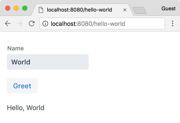
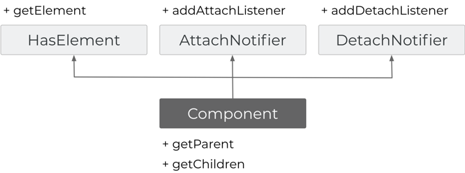
Vaadin is an open-source web development platform for implementing HTML user interfaces (UI) using Java. Vaadin's strength is in its server-side API, Vaadin Flow, which allows not only the composition and implementation of UI components but also the direct manipulation of the Document Object Model (DOM) from the server.

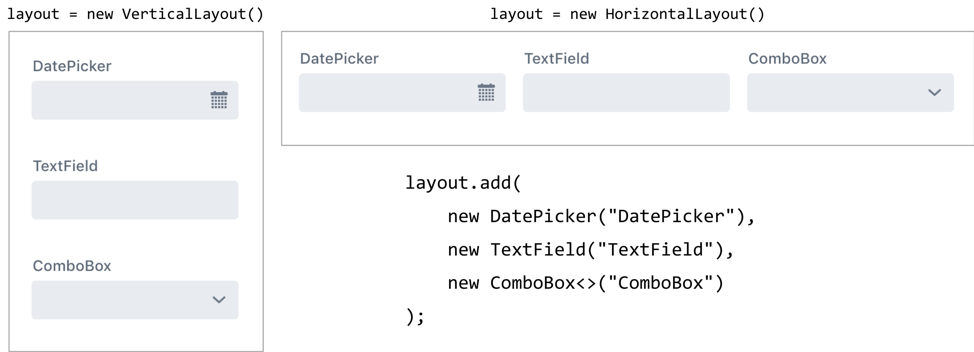
With Vaadin Flow, developers implement the UI in Java running on the server side by using components such as text fields and buttons, arranging them into layouts, and connecting them to business logic through event listeners.

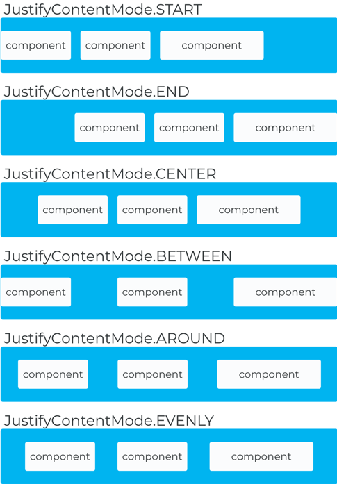
Vaadin Flow provides a variety of high-level ready-to-use UI components optimized for mobile and responsive design. It also includes data binding helpers, URL-based navigation, Web Components integration, and support for HTML templates.

Image title

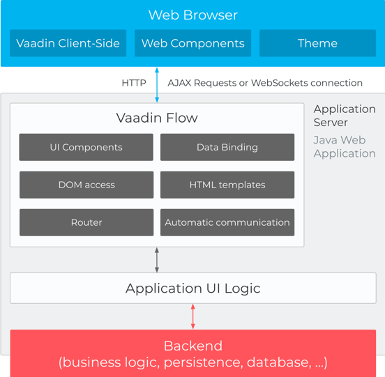
Figure 1: Vaadin client-server architecture

Since modern IDEs can list classes, methods, and even Javadocs, this Refcard is a reference guide to things IDEs can’t quickly or directly tell you.

Section 2

Important Links

Website: https://vaadin.com

Vaadin Flow’s information page: https://vaadin.com/flow

Blog: https://vaadin.com/blog

Documentation: https://vaadin.com/docs

List of components: https://vaadin.com/components/browse

Components directory: https://vaadin.com/directory

Forum: https://vaadin.com/forum

GitHub: https://github.com/vaadin

Section 3

“Hello, World” With Vaadin Flow

The following example shows how to implement a simple UI with a text field and a button that, when clicked, invokes server-side logic that adds a greeting text to the layout:

​x
1
@Route("hello-world")
2
public class HelloWorld extends VerticalLayout {
3
​
4
  public HelloWorld() {
5
    // two components:
6
    TextField name = new TextField("Name");
7
    Button greet = new Button("Greet");
8
​
9
    // add them to "this" layout (a VerticalLayout)
10
    add(name, greet);
11
​
12
    // add logic through event listeners
13
    greet.addClickListener(event ->
14
        add(new Span("Hello, " + name.getValue())));
15
  }
16
​
17
}


Image title

Figure 2: The “hello, world” application rendered as HTML in the browser

You implement user interfaces by extending an existing UI component such as VerticalLayout and annotating it with @Route. You can build up the UI by combining Vaadin components such as TextField, Button, Span, and many others to which you can add behavior by defining event listeners. The code runs on the server, which allows you to easily connect the UI to business logic. Optionally, you can customize the look and feel with CSS, bind UI components to backend data, manipulate the DOM from the server side in Java, and integrate Web Components.

Section 4

Bootstrapping a Project

The easiest way to bootstrap a new Vaadin Flow project is by using the project templates at vaadin.com/start. Select any of the templates for Vaadin version 10 or later, download and extract the zip file, and import it into your favorite IDE.

6
1
Alternatively, you can add the vaadin-core dependency in any Java web application and start using Vaadin Flow right away. With Maven, you can add the following to the pom.xml file:
2
<dependency>
3
    <groupId>com.vaadin</groupId>
4
    <artifactId>vaadin-core</artifactId>
5
    <version>LATEST</version>
6
</dependency>

Vaadin Flow requires the Servlet API version 3.1 or later. You can add it with Maven as follows:

6
1
<dependency>
2
    <groupId>javax.servlet</groupId>
3
    <artifactId>javax.servlet-api</artifactId>
4
    <version>3.1.0</version>
5
    <scope>provided</scope>
6
</dependency>
Section 5

Components

All Vaadin UI components directly or indirectly extend the Component class. You can add visual components and layouts into other layouts. There’s always one root component for each view that is mapped to a URL with a @Route annotation. Figure 3 shows the Component abstract class, interfaces it implements, and some of the relevant methods. All of the 3 interfaces are also functional interfaces.

Image title

Figure 3: The Component Interface

You’ll see this API pattern throughout the framework: abstract and concrete classes implementing mixin interfaces to build up the functionality of the component. For example, the CheckBox class directly or indirectly implements the HasSize, HasStyle, Focusable, ClickNotifier, and HasValueAndElement interfaces. You don’t need to memorize or even use this interface when creating a UI. However, knowing about them and their methods will help you to understand the features available in the UI components. The following table shows the mixin interfaces, their purposes, and their methods:

Interface Purpose Methods
1
1
BlurNotifier
Handle blur events
1
1
addBlurListener
1
1
ClickNotifier
Handle click events
1
1
addClickListener
1
1
CompositionNotifier
Handle DOM Composition events (text input)
3
1
addCompositionStartListener
2
addCompositionUpdateListener
3
addCompositionEndListener
1
1
Focusable
Focus, blur, and set tab order (extends HasElement, BlurNotifier, FocusNotifier, and HasEnabled)
4
1
setTabIndex
2
getTabIndex
3
focus
4
blur
1
1
FocusNotifier
Handle focus events
1
1
addFocusListener
1
1
HasAutocapitalize
Enables usage of the autocapitalize attribute
2
1
setAutocapitalize
2
getAutocapitalize
1
1
HasAutocomplete
Enables usage of the autocomplete attribute
2
1
setAutocomplete
2
getAutocomplete
1
1
HasAutocorrect
Enables usage of the autocorrect attribute
2
1
setAutocorrect
2
isAutocorrect
1
1
HasComponents
Add and remove child components (extends HasElements and HasEnabled)
3
1
add
2
remove
3
removeAll
1
1
HasDataProvider
Enable data providers
2
1
setDataProvider
2
setItems
1
1
HasElement
Retrieve underlying element
1
1
getElement
1
1
HasEnabled
Enable or disable components (extends HasElement)
2
1
setEnabled
2
isEnabled
1
1
HasOrderedComponents
Enable component order (extends HasComponents)
4
1
replace
2
indexOf
3
getComponentCount
4
getComponentAt
1
1
HasPrefixAndSuffix
Enable prefix and sufix slots for inserting components
4
1
setPrefixComponent
2
getPrefixComponent
3
setSufixComponent
4
getSufixComponent
1
1
HasSize
Enable component sizing
6
1
setWidth
2
getWidth
3
setHeight
4
getHeight
5
setSizeFull
6
setSizeUndefined
1
1
HasStyle
Enable CSS styles and CSS class names
8
1
addClassName
2
removeClassName
3
setClassName
4
getClassName
5
hasClassName
6
addClassNames
7
removeClassNames
8
getStyle
1
1
HasText
Enable content text
2
1
setText
2
getText
1
1
HasValidation
Enable input validation
4
setErrorMessage
1
1
HasValue
Enable user-editable values
11
setRequiredIndicatorVisible
1
1
HasValueAndElement
Extends HasValue, HasElement, and HasEnabled See extended interfaces
1
1
InputNotifier
Handle input events
1
addInputListener
1
1
KeyNotifier
Handle keyboard events
3
addKeyPressListener
1
1
PollNotifier
Handle events for asynchronous UI updates
1
addPollListener
1
1
SortNotifier
Handle sort evenrs
1
addSortListener
Section 6

Input Components

All input components implement HasSize (except ListBox), HasStyle, and, for most of them, HasValue and Focusable. The following table shows other of the mixing interfaces implemented by each input component:

Component Mixin interfaces
1
1
Button
1
1
ClickNotifier, HasText, Focusable
1
1
CheckBox
1
1
Focusable, ClickNotifier, HasValueAndElement
1
1
ComboBox
1
1
HasValidation, HasDataProvider, Focusable,  HasValueAndElement
1
1
DatePicker
1
1
HasValidation, Focusable,  HasValueAndElement
1
1
Grid
1
1
HasDataProvider, Focusable, SortNotifier
1
1
IronList
1
1
HasDataProvider, Focusable
1
1
ListBox
1
1
HasItemsAndComponents, HasDataProvider, HasValueAndElement
1
1
TextField
1
1
HasSize, HasValidation, HasPrefixAndSufix, InputNotifier, KeyNotifier, CompositionNotifier, HasStyle, Focusable,  HasValueAndElement
1
1
TextArea
1
1
HasSize, HasValidation,         HasPrefixAndSuffix, InputNotifier, KeyNotifier, CompositionNotifier,         HasAutocomplete, HasAutocapitalize, HasAutocorrect, HasStyle, Focusable, HasValueAndElement
1
1
PasswordField
1
1
HasSize, HasValidation,         HasPrefixAndSuffix,         InputNotifier, KeyNotifier, CompositionNotifier, HasAutocomplete,         HasAutocapitalize, HasAutocorrect, HasStyle, HasValueAndElement
1
1
RadioButtonGroup
1
1
HasItemsAndComponents, HasDataProvider, HasStyle, HasValueAndElement
1
1
Upload
1
1
HasSize, HasStyle
Section 7

HTML Components

There are UI components that represent most common elements in HTML and that extend the HtmlComponent class, for example: Div, Span, Section, Header, Footer, Article, H1, H2, H3, H4, H5, H6, Paragraph, Label, Anchor, OrderedList, ListItem, Image, and several others.

Tip: If you come from previous versions of Vaadin, note that the Label class is mapped to the label HTML element which is intended to be a label for an input element. Use components such as Span, Text, or Div, instead of Label when migrating from previous versions of Vaadin.

Section 8

Notifications

You can show notifications using the Notification class or its static show method. Notifications accept text or UI components:

6
1
new Notification(
2
    new VerticalLayout(
3
        new Span("Terms accepted."),
4
        new RouterLink("Learn More", TermsView.class)
5
    )
6
).open();
Section 9

Sizing

You can adjust the size of any Component that implement HasSize. The size of components can be set in fixed or relative units by either dimension (width or height) or be undefined to shrink to fit the content. You can either use explicit size or define it relatively from the area provided by the parent component. Notice that if all the components in a layout have relative size in a particular direction, the layout may not have undefined size in that direction!

Method Description
2
1
setWidth
2
setHeight
Set the component size in either fixed units (px, pt, pc, cm, mm, in, em, or rem) or as a relative percentage (%) of the available area provided by the containing layout. The null value or -1 means undefined size (see below), causing the component to shrink to fit the content.
1
1
setSizeFull
Sets both dimensions to 100% relative size.
1
1
setSizeUndefined
Sets both dimensions as undefined, causing the component to shrink to its minimum size.

Layouts

A UI is built hierarchically from layout components, or more generally component containers, with the actual interaction components as the leaf nodes of the components tree. Some layouts accept multiple components and others a limited number.

Image title

Figure 4: Vertical and horizontal layouts

Section 10

Margin and Padding

Certain layouts (those implementing ThemableLayout) support setting margin and padding programmatically. Setting setMargin(true) and setPadding(true) enables all paddings and margins respectively. The margin and padding sizes can be adjusted with a CSS rule. Example:

The Java class:

@HtmlImport("styles/shared-styles.html").

6
1
public class MyComponent extends VerticalLayout {
2
  public MyComponent() {
3
    addClassName("custom");
4
    ...
5
  }
6
}

And the corresponding styles file (src/main/webapp/frontend/styles/shared-styles.html):

10
1
<custom-style> 
2
  <style>
3
    .custom {
4
      margin-left: 10px;
5
      margin-right: 20px;
6
      margin-top: 30px;
7
      margin-bottom: 40px;
8
    }
9
  </style>
10
</custom-style>
Section 11

Spacing

Certain layout components also support the setSpacing(true) method that controls the space between the contained components. Spacing can be adjusted with CSS properties (for example, --lumo-space-m: 20px).

Section 12

Alignment

Alignment is based in the Flexbox layout mode of CSS. With Flexbox, you have two axis: main axis and cross axis. In a VerticalLayout, the main axis is a column that runs from top to bottom (flex-direction: column, in CSS). In a HorizontalLayout, the main layout is a row that runs from left to right (flex-direction: row, in CSS). You can override to column-reverse or row-reverse with CSS if needed. Since the axes have a direction, you specify the alignment in terms of start/end instead of left/right or top/bottom. To set the alignment in the main axis you can use the setJustifyContentMode method.

Image title

Figure 5: Main axis alignments

To set the alignment in the cross axis you can use the following methods:

Layout For all components For individual components
1
1
VerticalLayout
2
1
setAlignItems(Alignment)
2
setDefaultHorizontalAlignment(Alignment)
2
1
setAlignSelf(Alignment, HasElement)
2
setHorizontalComponentAlignment(Alignment, Component)
1
1
HorizontalLayout
2
1
setAlignItems(Alignment)
2
setDefaultVerticalAlignment(Alignment)
2
1
setAlignSelf(Alignment, HasElement)
2
setVerticalalComponentAlignment(Alignment, Component)
Section 13

Grow (Expanding Components)

The setFlexGrow method allows you to configure how to distribute the space in a layout for each component. The flex grow property specifies the amount of the available space inside the layout a component should take up, proportionally to the other components. For example, if all components have a flex grow value of 1, the remaining space in the layout will be distributed equally to all components inside the layout. If you set the flex grow value of one component to 2, that component will take twice the available space as the other components, and so on.

Image title

Figure 6: Flex grow example

Section 14

FormLayout

FormLayout is a responsive layout that helps making forms readable in all screen sizes. The following example sets a FormLayout that uses 3 columns for widths of 22em or more, 2 columns for widths between 21em and 22em, and 1 column for widths of less than 21em:

4
1
formLayout.setResponsiveSteps(
2
  new ResponsiveStep("0", 1),
3
  new ResponsiveStep("21em", 2),
4
  new ResponsiveStep("22em", 3));
Section 15

Dialog

Image title

Figure 7: The same form layout rendered in different screen sizes Dialog is a popup layout you can show in the UI using its open method. For example:

4
1
Dialog dialog = new Dialog(
2
        new Span("Press ESC to close"));
3
dialog.setCloseOnOutsideClick(false);
4
dialog.open();

Grid and Lazy Loading

Grid, the component that shows your data in a tabular format, often plays a central part in business applications. The easiest way to use the Grid component is to pass the data as a list, stream, or array. In the following code example, Person is the domain object (a Java Bean):

5
1
Grid grid = new Grid<>(Person.class);
2
grid.setItems(listOfPersons);
3
// define columns and the order as bean properties
4
// (default: show all)
5
grid.setColumns("name", "email");

Alternatively, you can define columns programmatically. In this case, you don’t need to pass the domain type as a constructor parameter:

5
1
Grid grid = new Grid<>();
2
grid.setItems(people);
3
grid.addColumn(Person::getName)
4
  .setCaption("Name");
5
...

The addColumn method returns a Column object that can be used to further configure the column and the data representation. In the above example, we only configure the caption of the column. With bean-based listing, you can get a reference to the Column with getColumn(“propertyName").

The setItems method stores the given data in your server memory for rapid access. If your data grid contains a lot of data and you wish to save server memory, you can also do a lazy binding with your backend using the setDataProvider method:

5
1
grid.setDataProvider(DataProvider.fromCallbacks(
2
  query -> service.findAll(query.getOffset(),
3
      query.getLimit()),
4
  query -> service.count()
5
));

The example above uses the easiest solution, in which you only pass two lambda expressions: the first to provide the given range of items, and the second to provides the total number of items available. Alternatively, you can provide a custom implementation of the DataProvider interface.

Section 16

Data Binding

Binder is a helper class that allows you to bind Java properties to UI components so that the input made by the end user automatically gets written to your domain model. The Binder class also helps you to convert values and validate the data. The following binds firstName (String) and age (Integer) to two text fields:

13
1
Binder<Person> b = new Binder<>();
2
b.forField(firstNameField)
3
    // additional configuration
4
    .asRequired("First name must be defined")
5
    .bind(Person::getFirstName, Person::setFirstName);
6
b.forField(ageField)
7
    .withNullRepresentation("")
8
    .withConverter(new StringToIntegerConverter(
9
            "Must be valid integer !"))
10
    .withValidator(integer -> integer > 0,
11
            "Age must be positive")
12
    .bind(p -> p.getAge(), (p, i) -> p.setAge(i));
13
b.setBean(person);

You can also use the bindInstanceFields method to bind all the Java member fields that are also Vaadin fields (those that extend HasValue):

8
1
public class Form extends VerticalLayout {
2
  private TextField name = new TextField("Name");
3
    @PropertyId(“phoneNumber") // optional
4
    private TextField phone = new TextField("Phone");
5
​
6
    Form form = new Form();
7
    ...
8
    binder.bindInstanceFields(form);
Section 17

Routing and Navigation

You can link UI components to URLs using the @Route annotation. Optionally, you can specify a layout (that must implement RouterLayout) where the annotated component should be rendered, and implement HasUrlParameter if the view accepts parameters:

9
1
@Route(layout=MainLayout.class)
2
public class GreetingView extends VerticalLayout
3
        implements HasUrlParameter<String> {
4
    @Override
5
    public void setParameter(BeforeEvent event,
6
                             String parameter) {
7
        add(new Span("Hello, " + parameter));
8
    }
9
}

To pass the value world as a parameter, you can request the application with a URL like http://yourdomain.com/greet/world. The route name is derived from the class name removing any trailing "View". If the class is named MainView or View, it will be mapped to a root URL (""). You can override this by using the value property of the @Route annotation.

The following interfaces allows you to interact with the navigation lifecycle. You can implement observers in a UI component or manually register listeners using the UI class.

Interface Description
2
1
BeforeLeaveObserver
2
BeforeLeaveListener

Allows delaying or canceling the navigation, or changing the navigation to a different destination
2
1
BeforeEnterObserver
2
BeforeEnterListener

Allows changing the navigation to a different destination
2
1
AfterNavigationObserver
2
AfterNavigationListener
Allows updating parts of the UI once the navigation has been completed
Section 18

Custom Components

You can create custom components by using existing components and extending Composite, which allows you to hide the API of the actual root level component:

13
1
public class CustomTextField extends Composite<Div> {
2
  private Label label;
3
  private Input input;
4
​
5
  public CustomTextField(String caption, String value) {
6
    label = new Label();
7
    label.setText(caption);
8
    input = new Input();
9
    input.setValue(value);
10
​
11
    getContent().add(label, input);
12
  }
13
}

Implementing custom input fields is done by extending the AbstractCompositeField, AbstractSinglePropertyField, or AbstractField depending on your requirements.

To implement component "containers," implement the HasComponents interface. It includes default implementations for add(Component…) and remove(Component…) that you can override if needed:

9
1
@Tag("div")
2
public class CustomContainer extends Component implements HasComponents {
3
  @Override
4
  public void add(Component... components) {
5
    for (Component c : components) {
6
      getElement().appendChild(c.getElement());
7
    }
8
  }
9
}
Section 19

Element API

The Element API of Vaadin Flow allows you to manipulate the DOM from server-side Java. Most often you should use the Element API to create custom components or do small modifications to existing ones. Since the Component class implements the HasElement interface, all UI components have an underlying Element object that you can get with component.getElement(). The Element class represents an HTML element in the DOM and contains methods to update and query various parts of an element, such as attributes and child elements.

The following example shows how to create an input field with a companion label and how to set properties and styles:

13
1
Element label = ElementFactory.createLabel("Name:");
2
label.setProperty("for", "name");
3
​
4
Element input = ElementFactory.createInput();
5
input.setProperty("id", "name");
6
input.setProperty("value", "Jane");
7
input.getStyle().set("font-size", "28px");
8
input.getStyle().set("margin-left", ".5em");
9
input.getStyle().set("background-color", "deepskyblue");
10
input.getStyle().set("color", "#fff");
11
​
12
Element div = ElementFactory.createDiv();
13
div.appendChild(label, input);

Notice that an Element is not a Component. You can however add Elements into Components as follows:

2
1
VerticalLayout layout = new VerticalLayout();
2
layout.getElement().appendChild(div);
Section 20

HTML Templates

You can define the UI, or parts of it using, HTML:

17
1
<link rel="import" href="../bower_components/polymer/polymer-element.html">
2
<link rel="import" href="../bower_components/vaadin-text-field/vaadin-text-field.html">
3
<link rel="import" href="../bower_components/vaadin-button/vaadin-button.html">
4
<dom-module id="example-template">
5
  <template>
6
    <vaadin-text-field label="Name:" value="{{name}}"></vaadin-text-field>
7
    <vaadin-button onclick="{{buttonClicked}}">Send</vaadin-button>
8
  </template>
9
  <script>
10
      class ExampleTemplate extends Polymer.Element {
11
          static get is() {
12
              return 'example-template'
13
          }
14
      }
15
      customElements.define(ExampleTemplate.is, ExampleTemplate);
16
  </script>
17
</dom-module>

Tip: You can visually edit HTML templates in Eclipse or IntelliJ with Vaadin Designer.

The previous template imports the Polymer library and two Web Components: vaadin-text-field and vaadin-button. These are static resources packaged as a WebJAR and included with Vaadin (from a Bower-based installation).

The name value and buttonClicked method can be used server-side as follows:

12
1
@Tag("example-template")
2
@HtmlImport("src/example-template.html")
3
public class ExampleTemplate extends PolymerTemplate<ExampleModel> {
4
  public interface ExampleModel extends TemplateModel {
5
    void setName(String value);
6
    String getName();
7
  }
8
  @EventHandler
9
  public void buttonClicked() {
10
    Notification.show("Hello, " + getModel().getName());
11
  }
12
}

The ExampleModel interface defines getters and setters for the HTML attributes defined in the template (for example {{name}} in the HTML file).

Section 21

Themes

Vaadin separates the appearance of the user interface from its logic using themes. Theming is done, as with any HTML content, by using CSS. Vaadin 10 includes the Lumo theme. It has a light (default) and a dark variant:

4
1
@Route(value = "")
2
@Theme(value = Lumo.class, variant = Lumo.DARK)
3
public class DarkApplication extends Div {
4
}

UI components have variants you can set with the Element API:

2
1
Button button = new Button("Save");
2
button.getElement().setAttribute("theme", "contrast primary”);
Section 22

Custom Styles

Since Vaadin components are based in Web Components, you have to put the CSS in an HTML file and load it with the @HtmlImport annotation:

3
1
@HtmlImport("frontend://styles/shared-styles.html")
2
public class MainLayout extends Div implements RouterLayout {
3
}

In the shared-styles.html file (located in src/main/webapp/frontend/styles) you can add any CSS rules as follows:

5
1
<custom-style>
2
  <style>
3
    ... CSS here ...
4
  </style>
5
</custom-style>

Lumo defines CSS custom properties that allow you to quickly modify the look and feel of an app:

10
1
<custom-style>
2
  <style>
3
    html {
4
      --lumo-font-family: Courier, monospace;
5
      --lumo-border-radius: 20px;
6
      --lumo-base-color: #fafbfc;
7
      --lumo-primary-color: #00b4f0;
8
    }
9
  </style>
10
</custom-style>

You can add CSS class names to any UI component using the addClassName and addClassNames methods:

1
1
addClassName("custom");

This class name can be used in a selector in the shared-styles-html file:

3
1
.custom {
2
  color: red;
3
}

Deployment

To deploy a Vaadin Flow application in a production environment, you must add the vaadin-maven-plugin in a Maven profile in the pom.xml file and compile the project specifying the name of the profile (for example, mvn clean package -PproductionMode). This performs three main tasks:

  • Transpilation: Converts ES6 JavaScript to ES5 JavaScript to support older browsers.

  • Minimization: Makes JavaScript files smaller.

  • Bundling: Bundling: Stitching together a group of modules into a single file.

For details about how to add the vaadin-maven-plugin, see https://vaadin.com/docs/v10/flow/production/tutorial-production-mode-basic.html.

In order to use the resources created by the vaadin-maven-plugin, you have to enable production mode using the @VaadinServletConfiguration annotation as follows:

7
1
@WebServlet(urlPatterns = "/*", asyncSupported = true,
2
initParams = { // optional
3
        @WebInitParam(name = "frontend.url.es6", value = "http://mydomain.com/es6/"),
4
        @WebInitParam(name = "frontend.url.es5", value = "http://mydomain.com/es5/") }
5
)
6
@VaadinServletConfiguration(productionMode = true)
7
public static class MainVaadinServlet extends VaadinServlet {}

You can also use system properties to override the @WebInitParam annotations. For example, you can pass the properties to the Jetty Maven Plugin as follows:

1
1
mvn jetty:run -Dvaadin.frontend.url.es6=http://mydomain.com/es6/ -Dvaadin.frontend.url.es5=http://mydomain.com/es5/

Notice that if you run the application using the Jetty Maven Plugin in production mode, you have to run it using mvn jetty:run-exploded.

Like This Refcard? Read More From DZone

related article thumbnail

DZone Article

What Future Java Releases Mean for Legacy Desktop Apps
related article thumbnail

DZone Article

A Deep Dive Into Firmware Over the Air for IoT Devices
related article thumbnail

DZone Article

Agentic AI for Automated Application Security and Vulnerability Management
related article thumbnail

DZone Article

Ensuring Configuration Consistency Across Global Data Centers
related refcard thumbnail

Free DZone Refcard

Java Application Containerization and Deployment
related refcard thumbnail

Free DZone Refcard

Introduction to Cloud-Native Java
related refcard thumbnail

Free DZone Refcard

Java 15
related refcard thumbnail

Free DZone Refcard

Java 14

ABOUT US

  • About DZone
  • Support and feedback
  • Community research
  • Sitemap

ADVERTISE

  • Advertise with DZone

CONTRIBUTE ON DZONE

  • Article Submission Guidelines
  • Become a Contributor
  • Core Program
  • Visit the Writers' Zone

LEGAL

  • Terms of Service
  • Privacy Policy

CONTACT US

  • 3343 Perimeter Hill Drive
  • Suite 100
  • Nashville, TN 37211
  • support@dzone.com

Let's be friends: